|
The Color Effect What Different Colors Say About Your Brand
Did you know that the favorite color for most people, independent of cultural background, is blue? Did you also know that studies have shown blue has a calming effect on stressed people? A saturated red color however, can raise the blood pressure and make one work faster. Young children tend to prefer bright colors. As we grow older, our color preferences often change into more muted tones, though those preferences vary from person to person and from culture to culture. When creating your products and marketing materials, you need to know what a color communicates to your target audience.
THE SCIENCE BEHIND COLOR We wouldn’t be able to see color if there was no light. Light hits a surface and reflects certain wavelengths and absorbs others. We see the green color because the surface reflects the green wavelength and absorbs all others. White surfaces reflect all light waves and black absorbs them. Inside the eye we have nerve cells that are sensitive to degrees of light wavelength. The cells send the information to the brain where it is processed and recognized. There are three primary colors of light – red, blue and green. When you mix primary colors you get what is called a secondary color. For magenta, mix red and blue. For cyan, mix green and blue, and for yellow, mix green and red. If you mix the three primary colors together you end up with white. For those of us working with printing there is a different set of primary colors – the one for pigment. In the pigment color wheel the first hues we use are the primary colors; red, yellow and blue. The secondary hues are purple, green and orange. The third are called tertiary and consists of six hues: red-orange, yellow-orange, yellow-green, blue-green, blue-violet and red-violet. 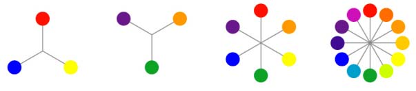 The primary, secondary and tertiary colors have no black, white or grey in them. This means that the colors are fully saturated. The word saturation describes the intensity of a hue. All other colors have a measure of white, grey or black in them and are described as having lighter or darker value. When there is a white value in a color they are named tints, when black is added it is a shade. YOU AND COLOR What word would you connect with a specific color? Take a look at the colors below and find the word that you think best matches each color. Write the number in the blank box beneath each color. Ask a colleague to do the test too. 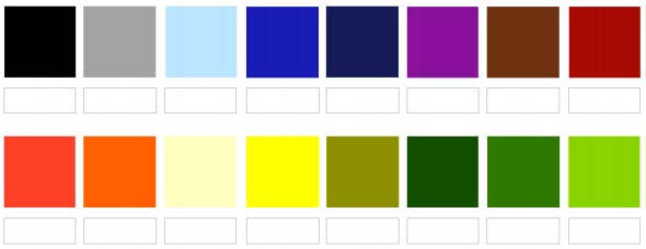 1. Beautiful 2. Ugly 3. Cold 4. Warm 5. Fast 6. Slow 7. Kind 8. Mean 9. Male 10. Female 11. Happy 12. Serious 13. Old 14. Young 15. Health 16. Illness 17. Lively 18. Passive 19. Near 20. Far 21. Safe 22. Dangerous 23. Jealousy 24. Truth Did you and your colleague have similar results? Do you think a person from a different culture would have the same result as you? You might be surprised to learn that colors have culturally specific connotations. For instance, in the western world white is a color considered pure, clean and innocent. Traditionally, white is the color of wedding dresses. However, in the east, white is the color of mourning. COMMON COLOR ASSOCIATIONS Black - power, evil, death, formality, sophistication, elegance, style, mourning, anger, sadness, unhappiness, sexuality, fear, depth, rebellion Grey - elegance, respect, boredom, decay, old age, dust, wisdom, pollution, neutrality. White - reverence, purity, innocence, truth, snow, winter, peace, cleanliness, hygienic. Eastern cultures: sterility, coldness, mourning Brown - wood, stability, calm, nature, richness, rustic, tradition, dirt, filth, heaviness poverty, earth, dependability, simplicity, sad, masculine Beige - neutral, calm, relaxing Yellow - joy, happiness, optimism, idealism, imagination, sunshine, summer, hope, betrayal, jealousy. Eastern cultures: sacred, imperial. In Japan: courage, in Egypt: mourning. A bright yellow is the most difficult color for the eye to take in and can be overpowering if used in large quantities. Orange - energy, balance, warmth, enthusiasm, vibrancy, attention, flamboyancy, happiness, attraction, success, encouragement, stimulation, heat, fascination, creativity, sunshine, determination Red - fire, blood, energy, war, danger, strength, power, determination, passion, desire, love, speed, violence, anger. In China red symbolizes celebration and fortune, in India it is the sign of purity Pink - spring, gratitude, appreciation, admiration, sympathy, femininity, health, love, marriage, sex, joy, innocence, purity Purple - royalty, luxury, wealth, femininity, romance, envy, sensuality, spirituality, creativity, ceremony, mystery, wisdom, enlightenment, arrogance, profanity, confusion, pride, cruelty. In Thailand it is the color widows in mourning are using Blue - water, sky, calmness, trust, dignity, ice, loyalty, cold, conservatism, air, royalty, nobility, confidence, unity, stability, order, tranquility, cleanliness, order, security, depression. In China blue is associated with immortality. For Hindus, its associated with Krishna. In the Middle East, it’s a protective color and for Jewish people it symbolizes holiness. Blue is the favorite color for most people, independent of their culture and country of origin Green - nature, calm, refreshing, youth, environment, health, renewal, vigor, inexperience, spring, fertility, envy, misfortune Dark green - masculine, conservative, wealth. A popular color, one of the most common favorite colors Common color associations should always be taken into account when you are considering what colors to use in your products, your logo, your marketing materials, and your trade show display booths. This is particularly true if you are entering a foreign market for the first time, or designing a product you hope will have global appeal. Your color choices communicate many things about your brand, and may ultimately tip the needle toward success or failure. |